~ Terry Brown ~
UI/UX Design, Usability Testing, Graphic Design, and Animation
Terry Brown
4740 Winding Creek Ave, Santa Rosa, CA 95409
Cell phone: 707 486-3476
eMail: terry@terrybrown.com
CAREER SUMMARY
My UI/UX Design career started at Apple Computer where I learned from the thought leaders of user interface design as this discipline was being developed. From the beginning, it was important to know how to clearly define a product. This starts with understanding the business objective, developing personas, wire-framing, creating interactive prototypes, running usability testing sessions, presenting results to get buy-in, and then designing all the graphics, icons, text, and any other assets needed to make the product a reality. I added to that experience as I moved on to other companies like Adobe Systems, Quark, and several startups such as Pixorial.com. My technical experience started with desktop applications, then I moved on to web applications, and now I’m working on bringing that knowledge to the development of smart phone and tablet applications.
COMPETENCIES
User Interface Design. Gather requirements, define target audience, perform task and skill analysis, develop wireframes, create prototypes, write usability testing scenarios, run usability sessions, present usability findings and provide recommendations for adjustments, write user interface design specification, create icons and all other user interface graphical design elements, define menu structure and keyboard shortcuts, and write heuristic evaluations. Also, shoot and edit video, create GIF or Flash animations, digital photography, photo editing in Photoshop, and optimize graphics for web or mobile app delivery.
PROFESSIONAL EXPERIENCE
APP CONTENT DESIGN
Duo Sports, Inc
San Jose, California – July 2013 to Present
Currently creating all the graphics and animations for an iPad and iPhone app. The app is designed to appeal to younger children as a curiosity adventure.
USER INTERFACE DESIGNER
Terryvision Design Services
(This is my own Contract Design Service)
San Jose, California – July 2001 to Present
This is my contract UI/UX Design service. Summary of the main contracts I’m working on or have completed:
- The Evans Group of Boca Raton, Florida. Web design and marketing work. Shot photos, designed website and created training videos for them. (http://www.theevansgroupllc.com)
- July 2007 to July 2012 - Completed 5 year User Interface Design and Usability testing contract for Pixorial (http://www.pixorial.com).
I did a lot of UI/UX and Usability work for Pixorial. I also did a number of promo videos and tutorials which help to explain the service. You can view a few photos/videos to the right >> Unfortunately, they went out of business.
- OEX Options - September 2006 to December 2011 - Site Designer, Administrator, and Partner in the subscription service: http://www.oexoptions.com
- Oct 17, 2005 to Oct 17, 2006 - One-year contract for Network Appliance (NetApp) in Sunnyvale, Ca. I provided Web Design, Instructional Design, PowerPoint skills, and Graphic Design services.
- 2001 thru 2002 - Completed 18-month contract with Quark, Inc (http://www.quark.com) in Denver, Colorado.
- Designed the user interface for Quark's desktop products and new web-based solutions. This included products for Workflow Project Tracking, Media Independent Publishing, Online Publishing Solutions, Digital Asset Management Database, and icons for Quark XPress (Page Layout).
- The target audience for Quark’s products was publishers of content for newspapers, magazines, catalogs, and web sites.
- Created usability testing prototypes and test scenarios. Ran usability test sessions.
- Wrote detailed user interface specifications.
- Created icons and graphical design elements for all assigned projects.
- Helped the company to visualize a Media Independent Publishing Solution (MIPS) by providing interactive screen designs.
SENIOR CONSULTANT
Interlink, Inc
Denver (Inverness), Colorado - November 2000 to June 2001
- Designed the user interface for a variety of web and desktop client projects.
- Interlink is a contract engineering company whose target audience varied by project.
- Wrote heuristic evaluations for company products vs competitive products.
- Performed task and skill analysis for each assigned project by interviewing subject matter experts and witnessing task performance.
- Created interactive wireframe task flow diagrams using Visio.
- Ran usability sessions to further task analysis and validate proposed software solutions.
- Wrote implementation and design specifications using the Rational Unified Process for system development (RUPS).
- Created icons and graphical user interface design elements for all assigned projects.
DIRECTOR, PRODUCT USABILITY
OpenGrid, Inc
Santa Clara, California - September 1999 to November 2000
- Defined and designed the user interface for a large content distribution platform with access and delivery on the web and on wireless devices. The infrastructure required a user interface for viewing and subscribing to content. It also required a UI that allowed content contributors to upload small applications then charge a subscription fee.
- Performed task analysis to determine the types of content that would be included and how the content would be used.
- The target audience for this website included people who needed to subscribe to content that they could use on their own websites, and developers who would provide content or functionality to the service. The developers had the option of providing their offerings for free or be able to charge a subscription fee.
- Created interaction flow diagrams (wireframes).
- Wrote usability test scenarios, then prototyped screens for usability testing.
- Wrote user interface design specification for use by engineering, marketing, and quality assurance.
- Created icons and other graphical user interface design elements.
Email Aggregation Module
- Designed an Email aggregation program for web and wireless access.
- The target audience for the Email aggregation program was business executives and anyone in the hi-tech industry that typically had multiple email accounts and used wireless devices such as PDAs and cell phones.
- Created screen designs and dialog layouts.
- Ran usability testing sessions to test proposed solutions and gage interest in the product.
- Wrote heuristic evaluations for company products vs competitive products.
USER INTERFACE DESIGNER
ChannelPoint, Inc
Colorado Springs, Colorado - September 1998 to September 1999
- Designed the user interface for rules-based insurance eligibility software. The purpose of the software was to automate the tedious paper-based processes of qualifying collections of individuals within company-paid insurance plans.
- The target audience for the software was processing agents within insurance companies.
- Performed task analysis to determine how work was being completed without using computers.
- Provided wireframes and screen designs for feasibility analysis.
- Ran interactive usability studies to determine if proposed solutions met the required needs.
System Administration Tool
- Designed the user interface for a web-based system administrator for maintaining multiple servers.
- The target audience for the product was system administrators who were tasked with keeping multiple servers online 24 hours a day. The system had to be secure, but the status of all nodes constantly accessible via the web for immediate action.
- Defined the tasks and skill sets of the typical system administrator.
- Wrote a user interface design specification. The target audience for the specification was the engineers who built the product and the quality assurance group who tested the system.
- Created all icons, UI graphics, and branding graphics.
USER INTERFACE DESIGNER
Adobe Systems, Inc. (http://www.adobe.com)
San Jose, California - January 1997 to September 1998
- Defined the design direction and created the user interface for Adobe's professional video editing software (Premiere 5) and special effects software (After Effects 4.0) in collaboration with engineering, marketing, and product users.
- The targeted audience for the editing software shifted from multimedia developers to professional video editors. Many design decisions such as keyboard shortcuts were made to accommodate professional video editors rather than graphic artists and multimedia producers.
- Gathered product requirements from marketing, engineering and user-focus groups.
- Performed task analysis to clarify the process used by professional video editors.
- Created preliminary interactive prototypes and screen layouts.
- Tested concepts with users before development. Conducted alpha and beta testing during development.
- Defined application menu structure, keyboard shortcuts, and context menus.
- Wrote UI specifications for use by engineering, marketing, quality assurance, and user education.
- Created product icons, buttons, cursors, screen and dialog layouts.
- Wrote recommendations for current and future product UI changes utilizing data collected from users.
- Addressed cross-platform design issues - Macintosh, Windows, Unix.
- Addressed localization issues.
- Wrote heuristic evaluations for company products vs competitive products.
VISUAL INTERFACE DESIGNER
Infoseek, Inc.
Santa Clara, California - May 1996 to January 1997
- Provided screen layouts, typographic elements, illustrations and icons for Infoseek's information search portal.
- Designed the look and layout of search results pages.
- The target audience for this search engine was open to anyone using the internet, so it was broad and varied.
- Created alternate branding schemes for affiliate companies.
- Conceptualized and designed banner advertisements.
- Wrote heuristic evaluations for Infoseek’s services vs competitive products.
USER INTERFACE and INSTRUCTIONAL DESIGNER
Apple Computer, Inc. (http://www.apple.com)
Cupertino, California - Dec 1988 to May 1996
- Led effort to transform training materials and technical procedure manuals from a paper-based medium to an interactive multimedia system with delivery on CD using Computer-Based Training (CBT) rather than paper.
- The targeted audience for this large conversion project was internal Apple Support personnel and third-party Service Engineers who repaired Apple computers.
- Because this delivery method was so new for technicians, we performed numerous usability sessions and site visits throughout the development process. The rate of acceptance was tracked and their feedback was used to make continuous improvements to the CBT product.
- For delivery as CBT, I experimented and developed methods for creating highly optimized screen graphics and instructional video.
- Once the internet became a viable delivery method, we began making further design enhancements to provide the technicians with timely service information as it became available using Web-Based Training (WBT).
Diagnostics Software:
- Designed the visual and interaction interface for diagnostics software.
- Most of the diagnostic software was targeted for Apple Support personnel and Service Engineers, however, two products (Disk First Aid and Apple Personal Diagnostics) were developed for use by all Apple computer owners.
- Defined skill set of Service Engineers vs end users.
- Created interactive prototypes of diagnostics that were used for collection usability data.
- Wrote usability test scenarios
- Wrote all user interface specifications.
- Designed screen and dialog box layouts.
- Created all icons and graphical user interface design elements.
INSTRUCTIONAL WRITER & TECHNICAL ILLUSTRATOR
Storage Dimensions, Inc.
San Jose, California - June 1987 to Dec 1988
- Developed, wrote, and illustrated instruction manuals for mass storage devices.
- The target audience for the documentation was installation technicians and end users.
- The instruction manuals covered installation of the hard drives into computers and the use of partitioning and automated backup software.
INSTRUCTIONAL WRITER & TECHNICAL ILLUSTRATOR
Tecmar, Inc
Cleveland, Ohio - Dec 1985 to June 1987
- Developed, wrote, and illustrated instruction manuals for mass storage devices such as tape backup subsystems.
- The target audience for the documentation was installation technicians and end users.
EDUCATION:
Cooper School of Art
Major: Illustration and Graphic Design
Cleveland, Ohio - Graduated - June 1981
Electronic Technology Institute
Major: Electronic Technician
Cleveland, Ohio - Associate Degree- June 1983
SOFTWARE EXPERTISE:
Adobe's Photoshop (Bitmapped Photo Editing and Illustration) - Expert level
Adobe's Illustrator (Vector Illustration) - Expert level
Adobe's Premiere (Video Editing) - Expert level
Adobe's After Effects (Special Effects) - Skilled
Adobe's Frame Maker (Document Design) - Skilled
Adobe's Fireworks (Web and Mobile Graphics)- Skilled
Adobe's Flash (Vector-based Animations) - Skilled
Adobe's Dreamweaver (Website Creation) – Skilled
Visio (Wireframes and Visualization) – Skilled
Balsamiq Mockups - Skilled
HTML5 and CSS- Getting better everyday!
ScreenFlow (For video tutorials and demos) - Expert
Axure (For building prototypes for mobile devices) - Learning
APPLICATION DEVELOPMENT I’VE LEAD AS A SENIOR USER INTERFACE DESIGNER:
Pixorial.com’s full line of video uploading and video editing/creation products. (See samples under “Most Recent Work” below)
Adobe’s Premiere 5.0 - Video Editing Software (Formerly shipping product)
Adobe’s After Effects 4.0 - Special Effects Software (Formerly shipping product)
Web and Wireless eMail (OpenGrid),
eCommerce, promotional, scheduling, and community web site (OpenGrid)
Infoseek’s Search Engine Portal
Quark’s Workflow Management System (Shipping Product)
Disk First Aid - Hard Disk Checker (Apple)
Apple’s Apple Personal Diagnostics
Apple’s Service Source - Interactive Web and CD Service Provider Content
Sever Administrator - Remote server administration software (Channelpoint)
Insure - Insurance distribution software (Channelpoint)
QuarkStore - Quark's online product ordering website. http://www.quarkstore.com
Quark’s Media Independent Publishing System
Current Project
I recently finished Version 1 of an iPad/iPhone app for kids. This is a short animation from Crazy Mad House by DuoSports.com. I'm doing ALL the graphics and animations for this app using Adobe's Illustrator. The app is currently available in the Apple App Store: https://itunes.apple.com/us/app/crazy-mad-house/id908483890?ls=1&mt=8
Version 2 will have an awesome "Super Spy Lab" as well as a fun "Laundry Monkey"! Adobe's Illustrator was used to create all these scenes as well as each layer for the animations.
Wireframe Mockups

Wire frame using Balsamiq

Wireframe using images and html
Creating wireframe mockups is the process that gets a project up and running. I've created mockups using all sorts of methods including simple sketches on paper, white board drawings, as well as these two samples. The top one uses Balsamiq and the bottom sample uses simple html. Please click either to view a series of screens.
Product Screenshots
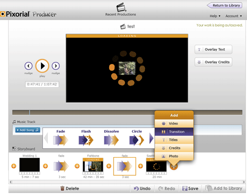
This is a screenshot from the Pixorial Producer user interface that allowed users to easily edit their video online without downloading an app. I worked on the user interface and ran all usability testing sessions.
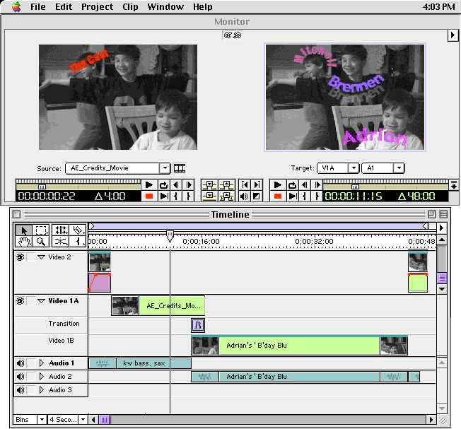
This is a screenshot from Adobe's Premiere v5.1. Details described below, but I did everything involving the UI for this app because I was the only UI Designer assigned to the project. I have a lot of experience with "full-scope" development.
![]() Premiere 5.1
Premiere 5.1
Premiere is Adobe's non-linear video editing product. The interaction design challenge moving from version 4.x to v5.x was to redesign the workflow to cut down on the numberous overlapping windows that hampered productivity. Users spent too much time moving windows around rather than staying focused on the tasks at hand. To that end, the source and preview windows from earlier versions were moved into one window (the Monitor window). This allowed many new editing features to be added because they made more sense within the dual window environment. A new list view was added to the Project window and a reordering of tracks within the Timeline was done to match user expectations of how they should behave.
Another big goal was to update the look and feel of Premiere to match other Adobe Products such as Photoshop and Illustrator. Palettes were redesigned, a Navigator palette was added, and keyboard shortcuts were changed to either match standard Adobe functionality or to match popular high-end video editing applications.
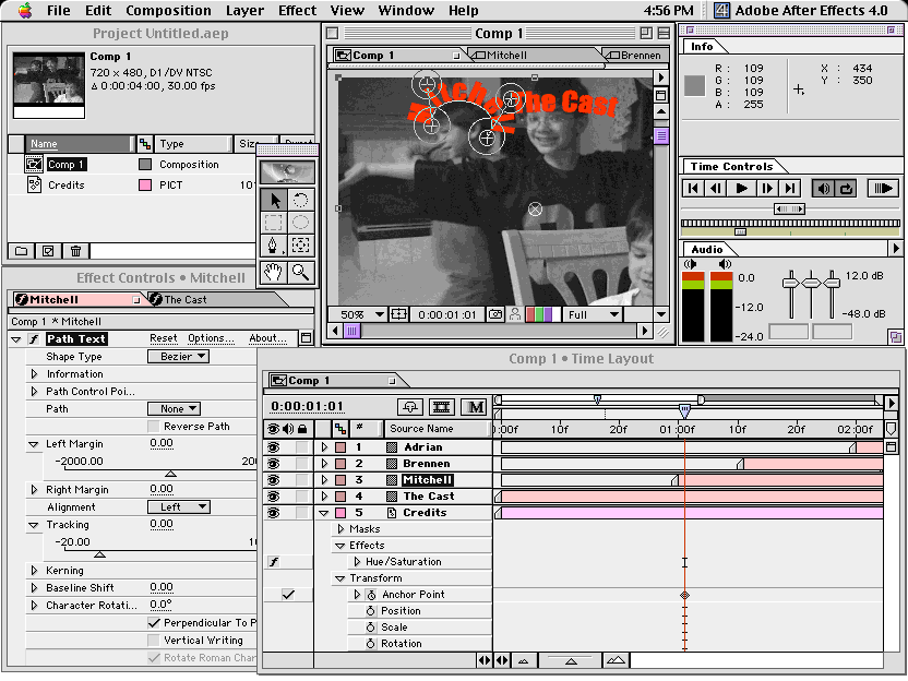
This is a screenshot from Adobe's After Effects v4. Details described below. I was the only UI Designer assigned for this version update.
![]() After Effects 4.0
After Effects 4.0
After Effects is Adobe's special effects and compositing program. It is a very popular program used in Hollywood and within broadcast studios worldwide. Just as in Premiere, one of the interaction design challenges moving from version 3.x to v4.x was to redesign the workflow to cut down on the numberous overlapping windows that hampered productivity. However, the same dual window approach would not work for After Effects. Here, the solution was to use 'tabbed windows'. Rather than having several windows of the same type open, you can now have just one main window of each type open, then quickly tab to the others. These windows can be pulled apart or opened independently when the need to compare content arises.
Just as in Premiere, the other big goal was to update the look and feel of After Effects to match other Adobe Products such as Photoshop and Illustrator. Windows, palettes and icons were redesigned, and keyboard shortcuts were changed where possible to match standard Adobe functionality in the other applications.
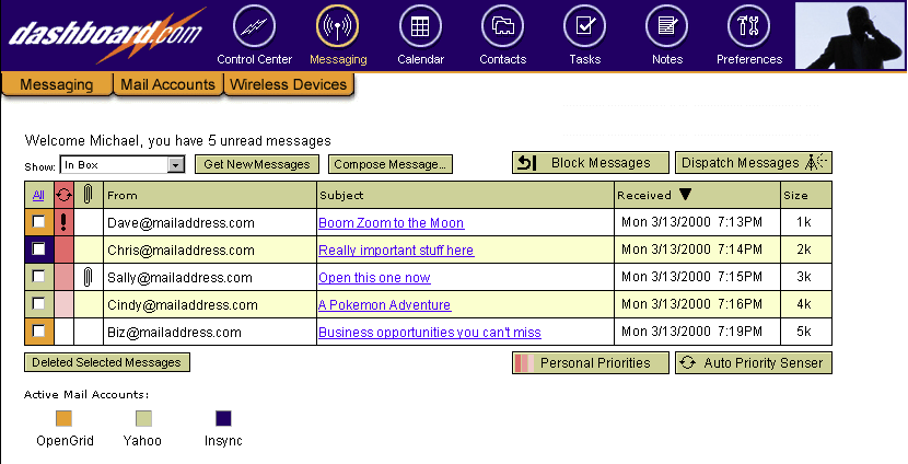
Messaging Application
This was a Messaging product that I worked on while at Opengrid. Opengrid created this product in partnership with Truesync. Opengrid had responsibility for everything that appeared within the Messaging section of this product. The user interface shown had already been though user interface testing and was in beta testing. I designed everything shown below the main (blue) navigation bar.
This messaging application was designed to aggregate several eMail accounts into one mailbox. It was also designed to accept and route messages from a cell phone. Messages from specified parties could be blocked completely or rated using personal priorities and accepted. E-Mail messages important to you could also be dispatched to a cell phone as a text message.

Opening Screen for a Digital Media System at Quark
Marketing Videos and a Tutorial
Sample marketing promo video I edited and produced for Pixorial using old video my Dad took while we were growing up. The old 8mm video was converted by Pixorial.
A fun little video I did with much hlep from my son to help promote Pixorial. The message is to convert your old videos using Pixorial.com before the video deteriorates to the point where it can't be done.
When Google announced Drive, Pixorial was selected as a launch partner. This was a tutorial I created for the occasion.
Icon Design

![]()
I've created hundreds of icons over the years.
Illustration Samples
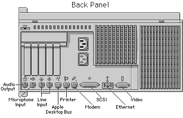
Technical Illustration using Adobe's Photoshop
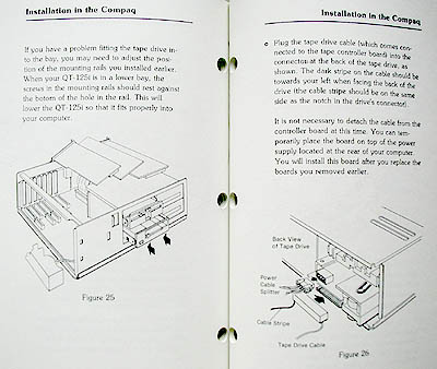
Technical Illustration using Adobe's Illustrator
contact: terry@terrybrown.com phone: (707) 486-3476