| Examples: Usability Evaluation > Prototype Testing |
Gathering Requirements and Conducting Testing
Overview Why Gather Use Requirements? (Continued below) |
Collecting observations about the client workplace
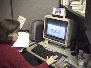
Initial Field Visit
What to Look For, Who to Talk To
For an initial visit, it is important to choose a variety of representative users of the product, from different workplaces, industries, and backgrounds. Have a plan for an approach to data collection which includes a list of what you would like to accomplish and how. Will it be through interviews, surveys, observation, or a combination of these?
Documenting the work environment
Use the time at the field site effectively. Try to collect as much data as possible there. Data analysis can be done after getting back to the office. Part of field observation is inquiry; that is, interviewing users about their jobs and the ways they use products. Another thing to look for are artifacts and outcroppings. Artifacts are physical objects in use at a site (notebooks, forms, reports, physical space arrangement, lighting, walls)
Outcroppings are noticable physical traits that mark or characterize the site (size of cubicles, size of whiteboards and what's written on them, uniforms or basic dress of certain castes of personnel).
How to Collect Artifacts and Data about Outcroppings
"Collecting artifacts and outcroppings" sounds like you're going on an archeological dig; in actuality, it's quite similar. In the same way an archeologist looks at the pottery of an ancient civilization to determine their nutritional intake, you can find objects during your field observation that will help identify how your users use your product. Perform the following steps:
- Identify the artifacts and outcroppings during interviewing/observation
- Collect and mark them onsite
- Take photos or video, get files on disk if possible, ask for maps or layouts of physical objects
- You can do remote observation by sending a disposable camera out to a site, and have the people there take pictures of their environment. - ----- Once you get the pictures, discuss them over the phone with the people at the remote site.
Group Relationships
- Group relationships of the client company can help identify process and information flows. They include organization, hierarchy, informal and formal links/interactions among groups, reporting relationships, etc.
- Communication Patterns
- Communication patterns show who talks to whom, and how often. For communication-intensive products, such as telephony, email, or advertising, this information is vital.
Inquiry
When asking people how they do things, or how they're supposed to do things, ask them, "Does that work?" "Do others do things differently?" "Why?" It is very important to avoid leading questions. You should try to have users tell you things as much as possible without any sort of prompting. When prompting is necessary, keep the questions open and general, such as, Tell me about the way you work now? or What would make your job better? rather than, Would it make your job easier if we added this feature to the product? The answer to that question will undoubtedly be, Yes, but you will not get much more supporting information or justification than that. In most cases, a client will agree to a new feature you suggest whether they know if they need it or not. You just end up creating unnecessary work for yourself.
Observations from the User Visit
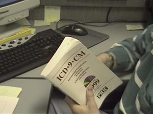
ICD 9 Codes
Observers documented a heavy reliance on an annually published book of ICD-9 codes used by the insurance industry. These are the publicly available codes that this company uses to create the business rules that are the essence of their business.
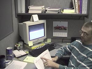
Create Rules
A worker demonstrates their current system for creating business rules for their clients. The challenge was to create a tool which would test the rules before the client turned them on in a live system.
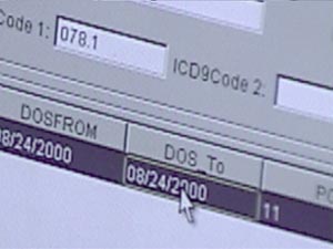
Excel spreadsheets are used heavily. Is that a good model to copy?
A heavy reliance on spreadsheets was noticed. Users were very comfortable and proficient working through a keyboard-centric heads-down spreadsheet environment. This would be a good thing to carry over into the Tool being created.
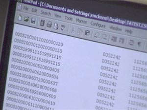
Number-heavy reports currently used to check rules. Surely we can do better.
The current method this company uses to test their rules relies on a text print out of all related codes. Reviewing this document requires a heavy reliance on domain expertise to parse and determine if the rules are working correctly. Ideally, this company wanted a system that was more automated and could be run by an employee who did not have strong domain experience.
User Testing
What to Expect
The following information explains how we set up a test and what to expect from testing sessions. It will also help you to understand how you can help out in the process.
Defining Your Goals
Before starting the testing process, it is important to define the broad goals of the evaluation. The question to answer is Why are we running this usability evaluation? Common motivators for usability evaluations include checking whether a user can collect specific information or perform certain tasks, such as completing a purchase transaction from start to finish. You can also use the test as a tool to resolve areas in which the clients and the developers have differing approaches to treating a specific component; for example, whether a pull-down menu works better than radio buttons do.
Decide what the primary data collection goals are. For example, are you assessing respondents' expectations and perceptions about the site, or are you collecting their feedback on what works well and what doesn't? You'll also need to decide if the results will come primarily through observation, or if the evaluation will be designed to collect quantifiable feedback, such as the successful completion rate of a specific test. Whatever your goals, make sure the data points are predefined and easily collectible.
What Are You Testing?
Once you've defined the broad goals of the test, you'll need to decide what exactly you're testing. A usability evaluation can take place anytime within a development cycle, so it's possible to test a site or product in just about any form:
- Paper prototype: Sketches or printouts of potential page layouts. Respondents may need to use a bit of imagination when assessing early-stage deliverables, but it's an excellent way to test page layouts.
- Design comp: Visual designs or mock-ups of proposed pages.
- Wire frame: Early versions of a site or product with limited depth and functionality. Useful for testing processes (registration, purchase, etc) and flow.
- Live site: Publicly available version of a functioning site or a self-contained site on a laptop computer.
- Competing Product: You can also test an existing competitive product. If thereís an existing product, pinpoint exact issues and compare to requirements.
After deciding what to test, set a date on which all edits to the test materials must stop. It's the same idea as a code freeze; the development team needs time to get the test materials in order.
What Is Your Client's Expectation?
Inform the internal team and the client about how the evaluation is going to run and how you'll incorporate the findings into the development process. This is an excellent opportunity to get internal buy-in and derail future attempts to question the test methodology. Often the final solutions to usability concerns come from the development team as a whole, not just the usability engineer. Make sure people understand how final decisions will be made and how they will impact the rest of the project.
A common misconception is that usability evaluations run the same way as marketing research groups. They don't. Head off this confusion at the start of the project. One notable difference is the sample size, which is much smaller, especially for discount usability evaluations. Market research focus groups often seek to collect perceptual information and establish generally relevant trends; Whereas the goal of usability is to identify problems to address in the design.
Setting Up the Test
It takes only five users to uncover 80 percent of high-level usability problems, according to Jakob Nielsen. But what if the five you've invited don't all show up for the evaluation? Because a typical turnout for evaluations is about one no-show per six respondents, it's a good idea to have a sixth person who can be ready if an extra respondent is needed.
The client should help to provide users. Make it clear that actual end users of their product are needed for testing. It is also important to have the input of subject matter experts and stakeholders, however the most valid feedback will come from the site or product end users.
Test respondents should approximate the intended users of the site (representative respondents). Unless you're evaluating a niche-oriented site or product (online brokerages, sports sites, and so on), bring in people of various levels of computer fluency, different age groups, and different genders. These people all think differently and provide unique insights.
Temp agencies and marketing research firms can often handle the respondent recruiting. Just keep in mind that people coming from recruiting agencies all have similar skews: they are looking for supplemental work. Just give the recruiting company a bit of notice and a screener (questions to ask potential respondents to ensure they fit the sample criteria).
Keep It Casual
Keep the setting of the evaluation informal and comfortable. When performing discount usability, consider using a small conference room with a "typical" PC or Mac, a little decor (so the room doesn't look sterile), and a work area. A bit of background distraction is actually a plus, because it creates a testing scene that's closer to reality. Nobody works in complete silence. If conference rooms in your office are in short supply, reserve one in advance. Nothing is worse than scrambling for space the day of the evaluation because you forgot to reserve the room. If your client wants to observe the test, make sure to rent a facility that has an observation room behind one-way glass or a closed-circuit TV, which won't distract the participants.
Regardless of where the evaluation is held, prep and inspect the room the day prior to the test. You should make sure that all the required supplies, such as computers, software, and chairs are there, and check that it all works properly. You should also have some snacks and beverages on hand for the testers. Once everything is in order, post a highly visible sign stating that the room will be in use for a usability evaluation.
What Are You Going to Ask?
The moderator's guide is an informal list of questions, scenarios, and key points that you may explore during the evaluation. It should be task-scenario based. Here are a few high-level issues to explore:
Describe the first items you notice.
Identify which elements are actionable/clickable.
What do you expect to find when this link or button is clicked?
Please describe your experience when trying to complete a task.
The guide will be influenced by the broad goals defined prior to the test, but the specifics of the evaluation are really determined by the respondent's actions. It's important to remain flexible and be willing to deviate from the guide when necessary. If the respondent is supplying useful information that wasn't anticipated in the guide, don't be shy about exploring that new route.
Writing some of these ideas down is a useful activity for the team because it gets them thinking about the specifics of the site. As moderators gain experience and confidence, they will be able to run the evaluation without the guide. But until they have the process down pat, keep a guide handy so they can refer to it.
Conducting the Evaluation
If you have selected the respondents properly you'll have a mix of representative users for your evaluation. Give them an overview of what a usability evaluation is, how it works, and what they can do to help you get the best information. Have them sign nondisclosure forms if necessary. Here are a few things that I often tell respondents before starting an evaluation:
Be honest in your responses. I didn't build the product you are evaluating, so you won't hurt my feelings with any criticism.
It's not you who is being evaluated, but the product. We'll encounter some problems, but if the site was perfect, we wouldn't need to test it.
As you move through the product, think aloud: verbalize what you are doing and why you are doing it.
Don't do things any differently than you would if you were at home or at work. (Respondents often try too hard to complete tasks to appease the moderator. For example, make sure they don't spend more time reading instructions than they normally would.)
The Moderator's Job
Responses will be more insightful when the evaluation is run like a conversation rather than an interview. Don't bombard the respondent with rapid-fire questions. In fact, you should be careful about interrupting the task flow. Insert questions for clarification or after a task is completed. Weave multiple questions together to create real-life scenarios. Here are a few tips to keep in mind:
When a respondent is frustrated or confused, don't belabor the point. The moderator only needs to see if the respondent could complete the task under "normal" conditions in a reasonable amount of time.
When there is a problem so prominent that it will hang up every user, the moderator doesn't need to burn time and have every respondent address the same concern.
When respondents identify a problem, make sure you clearly document it. Also, ask them how they would fix it. (And if they give you a really good answer, hire them on the spot!)
Be Observant
Don't lead respondents. It's about their opinions, not yours. Don't say things such as "This is a great way to find products, isn't it?" If you think they're trying to make a point but can't quite articulate it, paraphrase what you think they are saying and ask if that's correct. For instance, you could phrase your question like this: "Just to make sure I understand you correctly, I think I hear you saying it was difficult to register for the site because it asked for too much information? Is that right?"
Watch behavior, be aware of instances where there is a contradiction between performance (how fast a task was completed) and what the user reports.
Look for body language and facial expressions. It's possible to observe emotions such as confusion, frustration, satisfaction, or surprise. Nonverbal communication is often more revealing than spoken responses.
It's hard to moderate and collect feedback at the same time. Have an assistant help take notes and observe. Make sure he or she captures quotes from the respondent, because that makes the final report more convincing. This is also a great way to expose other members of your team to the inner workings of a usability evaluation. Audio and video are good for archival purposes, but they increase cost and are rarely watched. If video was shot, it's useful to create a highlights reel.
Reporting Your Findings
If your team took good notes, a lot of data now needs to be sorted and evaluated. Start by reviewing your notes with a highlighter to identify key quotes, recurring comments, and interesting findings. Then spend time determining which findings are most critical. Once key findings are identified and prioritized, it's time to start hammering out your report.
Report Vocabulary
Select the language used to describe the evaluation and the respondents carefully. By definition, a user has actually used the site, so refer to users who have not as participants. A representative user is somebody who fits the profile of a person who would actually use the site.
Also, steer clear from drawing concrete conclusions based on observations. When a conclusion is based on an observation and not a spoken response, make that distinction. For example, if a respondent appears frustrated or confused, the report should read "The respondent appeared frustrated," instead of "The respondent was frustrated."
Prepare and Organize the Report
Your goal for the written report is to provide a useful and readable document to the client, not just a thick packet of papers that gets filed away, unread. When writing the report, provide an executive summary, as well as specifics from the evaluation. With discount usability techniques, the goal is to identify usability concerns and potential solutions. Therefore, a majority of the report should focus on usability shortcomings rather than areas that tested well. Make sure the client understands this.
Use the following sections as a guideline when preparing your report:
- Overview: This is a high-level overview of the evaluation goals and methodologies used to collect data. Describes the test respondents, the data collection process, the testing facilities, and any considerations that potentially impact the results. Basically, this is the why and how of the test.
- Evaluation Highlights: If someone is only going to read one section of the report, this should be it. It includes self-explanatory headings, such as Significant Positive Task Performance and Significant Negative Task Performance. Also include an Interesting Findings section that discusses unexpected feedback that was especially notable. The highlights section should conclude with a selection of memorable quotes. A good evaluation captures respondent feedback, and the best way to communicate that is through respondent quotes.
- Results and Potential Solutions: Often the longest section of the report, this part details the findings of the usability evaluation. Highlight problematic areas through a combination of narrative and screen captures. The screen shots are especially effective for communicating the context of the problem. It's often easy to see the problem but extremely difficult to document it.
- Next Steps: Remember, this was only an evaluation. Now it's time to figure out what to do with the results. A usability evaluation does not exist in a vacuum, and the end solutions often reflect a compromise between all site concerns, such as visual design, branding, technology, and resource constraints. Also, use this section to recommend future evaluations.
Every good report also includes appendixes:
The moderator's guide references the questions asked to collect the data. This makes it easy to re-evaluate the product using the same test script.
Respondent profiles provide background information (demographics, experience level, Internet usage) on the test respondents.
Screen shots provide the context for the evaluation. All too often there is no documentation about which version of the product was tested and what it looked like. Screen shots capture the version of the product that was evaluated.
Make yourself available in person or on the phone to answer questions. If your clients don't understand what you gave them, the evaluation is useless. As sad as it sounds, it is not uncommon for the written findings from usability evaluations to remain unread. To make sure the results are disseminated, attempt to present the findings in person. Just like the evaluation, this step doesn't need to be high tech. It might be as simple as walking people through the highlights and findings of the report. This also ensures the client has no excuse for not being informed about the issues, and it provides an opportunity to address the client's questions on the spot.
Prototype Testing
There are many ways to create prototypes. You can use Macromedia's Director or similar prototyping tool to create an animated version of a program or you can simply string together static screens with html. Many times, feedback can be collected quickly by creating a series of paper-based screens that a user can use to view the flow and intended content scope.
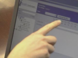
Prototype for the Tool being Tested
The prototype that was created for this product was created using java. This prototype was more elaborate in functionality than necessary, but served the purpose well. The tree view navigation system on the left side of the screen was functional and most buttons offered some sort of feedback when clicked. Note that this was not the final graphic design of product.
This product would be implemented with a detail view that is desirable for the overview the user can see of each node combined with a list view that displays the same data in a table. The table view works much like a spreadsheet for quick heads-down keyboard entry. Keyboard shortcuts identical to the ones used in popular spreadsheets would also be included in the final product.
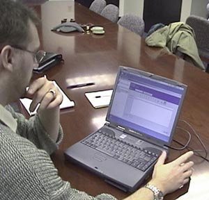
Collecting user feedback on prototype
One of the first things to let users know before they begin testing your product is that it is the product or program that is being tested, not them. If they run into a problem that they cannot solve, then the trouble is with the design of the product not because of a lack of knowledge or understanding on their part.
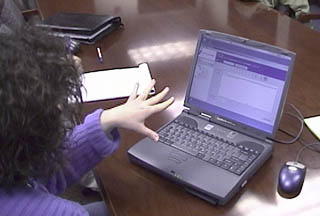
Get users to talk through problem areas
It is important when users are reviewing a prototype to get them to talk out loud. Encourage them to talk about what they are thinking as they work through a list of tasks. Get them to talk about where they think they are, where they can go from there, and how or why it will help to accomplish the task.
It is ok to ask questions of the user, but avoid leading questions. Keep questions open ended. If a user makes a comment that is unclear, ask them to explain or elaborate. If a user is not talking out loud, ask them what they are doing, or thinking, or looking for in order to get them talking.
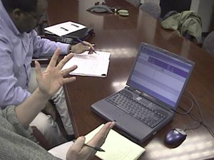
Project Manager attended the user testing sessions
When conducting testing sessions, it is great if another member of the development team can witness the testing. However, for the comfort of the person doing the testing, it is good to keep the number of people within the testing area to as few as possible. One or two is ok, three is the maximum number of people who should be in the same room as the tester. Many test labs have a viewing room so visitors can witness the testing without disturbing the comfort of the tester.
For our tests, the Project Manager assigned to the Tool was present for the tests. The feedback he got was immediate, and he was able to make last minute adjustments quickly.
Overall the testing went very well. There were no major usability problems uncovered.
|
|
contact: terry@terrybrown.comphone: (707) 486-3476
![]()